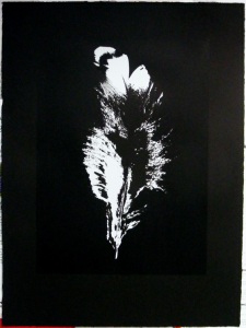
another take on “… there but for the grace of god”. I’d printed the white onto Somerset Velvet Black to see what it looked like, wasn’t too sure of it, something missing, so now I’ve gone and printed the black “key” stencil on there as well, and it works. I don’t think you can really make out from the photo how the black on black shows the detail, even when holding the print you have to look at it from a certain angle to fully appreciate the details. now to print some more, taking a bit more care this time, mebbe only an edition of three, to go with the other edition. have to rename it slightly, how about something like “this flight tonight”, or is that “tonite”. hah.
finished an edition [10] of “… there but for the grace of god”. I seem to have been playing around with this image on and off for a couple of months now, it’s printed in black and silver [lascaux aluminium] but the metallic sheen doesn’t show up to well in the photo.

over this last year as well as simplifying the visual aesthetics I’ve also been reducing the colour palette in my work, relying on variations of black, silver, grey and the occasional pink, w/the combination of black and silver being the current favourite.

[drying rack photo by rebecca]

happy bunny strikes again. I was working on these images last year [w/pink and no text] but wasn’t too sure of them, had another look at them recently and started  to adapt them to current concepts of including the title of the piece in the work itself / as a piece of work in its own right. need to be possibly printed up to A1 / A0 or there about, or something.